
What
Add a feature to Zelle
Company Goals
Adding a Feature
This project will heavily relies on research and was dictated by user needs and pain points. I wanted to diversify my portfolio by adding a feature to a Fintech application. Also, this project placed more constraints because the UI was already designed.
Why
To decide which aspects of a business needs to be improved and work under strict constraints
Enable customers and businesses to send fast digital payments
Enable trust directly through bank accounts
Anticipated Outcomes
Make sending and receiving money faster and more reliable for the user
Baseline Assumptions
Users spend more time using Zelle than other apps
The interface feels unfamiliar to new users
The onboarding process takes longer
Research
Competitive Analysis
I looked at competing money transferring apps to see the successes and pain points of each and how they handled their UX differently

User Surveys
I conducted 6 user surveys to determine challenges and pain points users were having with various money transferring apps

User Interviews
3 in person 2 remote
I conducted various user interviews to get a more individualized form of collecting insights
Example Questions:
Can you walk me through the process of how you would send money to someone?
What do you like about certain apps? What features?
Why might you use your favorite app over the others?
What might be missing or frustrating about money transferring apps?
How might those difficulties be resolved?
Responses:
“I don’t like Zelle through Bank of America because it’s confusing if you haven’t sent money to a person before”
“I do like profile pictures. Having the thumbnail and name is pretty useful. Security reasons.”
“I don’t like Zelle through Bank of America because it’s confusing if you haven’t sent money to a person before”
“It’s frustrating when the person doesn't have Zelle set up because then they have to accept the money. Essentially they need to set up an account with Zelle.”
Define
Affinity Mapping
I took the feedback I received from the interviews and surveys and began to create categories based on user inputs

Personas
I created two personas to help me empathize with the users and better understand their goals and needs


POVs and HMWs
I created multiple Point of View and How Might We statements to begin to turn user goals into solutions
POVs
I’d like to explore ways to help first time Zelle users make transactions quickly because they are frustrated with amount of steps it takes to send money.
I’d like to explore ways to help repeat Zelle users feel more comfortable with who they are sending money to because they don’t feel secure with their transactions.
I’d like to explore ways to help users of multiple money transferring apps feel more comfortable with Zelle’s interface because they are finding it not accessible or uneasy to use.
HMWs
How might we decrease the amount of time used to send money?
How might we simplify the path it takes to send money?
How might we give quicker options to new users?
How might we reduce the stress of sending money to an unknown user?
How might we add more transparency to who money is being sent to?
How might we clarify who money is being sent to?
How might we make Zelle’s experience more comfortable to the user?
Feature Set
I took the possible features and sorted them based on impact and effort to help decide what feature would be more beneficial to add.

RICE Scores
To determine and rationalize which feature to add, I utilized the RICE method to provide a quantitative score for the possible features

Design
Design Patterns
I began to gather the existing design patterns such as color and typography from the various Zelle platforms

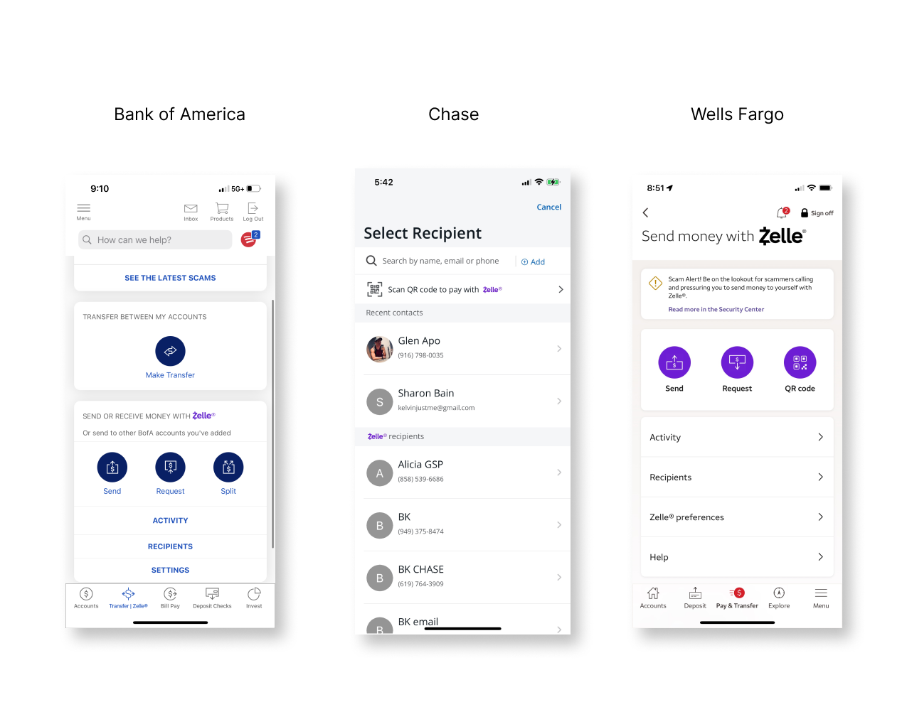
Design For Three Different Banks
I decided to create a new feature for Zelle on Bank of America, Chase and Wells Fargo
Site Map
I began to map out the possible pathways users could take from the home screen

User Flows
I created 3 user flows to better understand why a user takes a certain path and any alternative paths they might take

Low Fidelity Wireframes
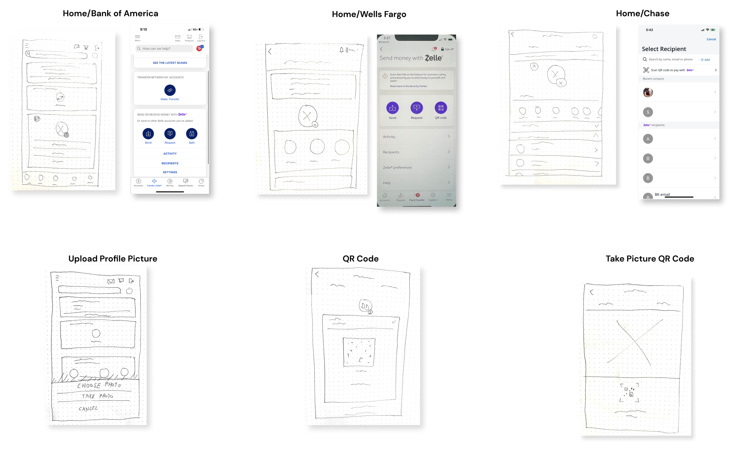
Mid Fidelity Wireframes

High Fidelity Wireframes
Bank of America


Chase

Wells Fargo

Prototype


Testing
Usability Testing
I conducted 4 usability tests to determine any pain points with my prototype

Revisions
Clickable Profile Picture
I allowed users to change the existing profile picture
Scan Animation
I created an input for users when they scan their QR code to signify the scan
Conclusion
This project was limiting because I was designing a new feature for an already existing app. So, the UI was already in place. I had to work around various parameters while still keeping the same design systems in place
This project focused a lot on research. The new feature was determined exclusively by user input and data
I had to design the same feature for three different banks. So, I learned how the different banks handled UI differently and how to integrate a similar functions using different layouts
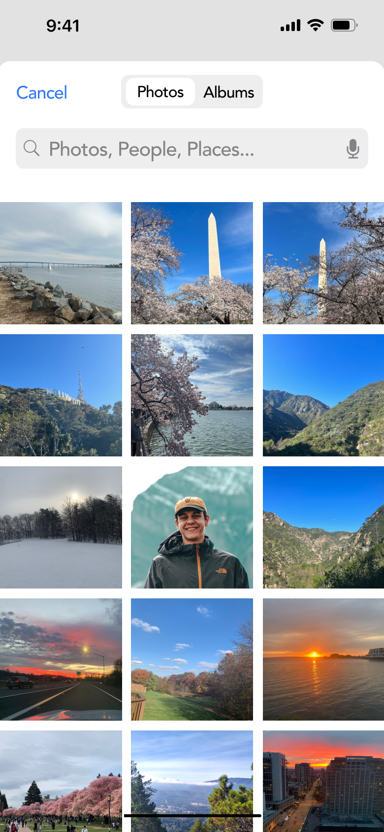
How might you complete the task of uploading a new profile picture?
How would you choose an existing photo as opposed to taking a photo?
How might you use your QR code to scan?
How might you scan someone else’s QR code?
What if you no longer want to send money to someone?
What did you find challenging when using the app?
What were the successes when using the app?
What is the impact you think these features might add?
Do you feel as though these changes were an upgrade? Why or why not
Example Questions